Welcome to Excel Avon
Butterfly chart in Excel
DOWNLOAD USED EXCEL FILE FROM HERE>>
In today’s post, we will show you how to create a butterfly chart in excel, although it is quite simple, here you have some data for which we need to create a chart. A butterfly chart is a simplified version of a diverging chart. , also known as a divergent chart. Butterfly charts typically leave spaces between columns to accommodate the names of the variables being compared, which is why they resemble butterflies with wings and a body:
We have data representing company values for the years 2022 and 2023. which we will present in the butterfly chart
Our butterfly chart will be ready in some way, just you have to explain the below steps carefully.

Make Butterfly chart in Excel
As you can see we have this data where column A contains the month, column B contains the data of 2022 and C contains the data of 2023. and we have to make butterfly chart for 2022 and 2023.
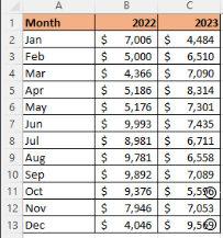
We’ll insert padding columns with the data to create a butterfly chart. Then name all the columns respectively Left Padding, Gap and Right Padding.

Now we will add a formula here which will find the max value of this dataset =max(c2:c 13, E 2:E13)+2000 But here we will use dollar sign to keep the range fixed and at the same time we will have to decrease the value of the adjacent cell.. =max(($c$2:$c$13, $E$2:$E$13)+2000)-C2
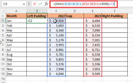
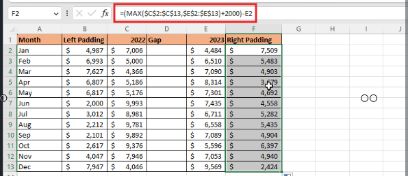
To apply the formula to all the cells, we will drag from B2 to B13, then for right padding, we will copy and paste the formula in E2, then we will do the same.
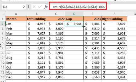
For gap we will take both the column then subtract 1000 from both and drag the gap column to the formula.
Now we will go On the Insert tab, in the Charts group, choose the Insert Column or Bar Chart button, From the Insert Column or Bar Chart dropdown list, under 2-D Bar, select Stacked Bar:

Excel creates a simple Stacked bar chart:
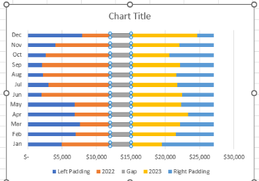
Make the gap invisible by using no fill, Same invisible formatting in left padding and right padding also fill no outline in left padding gap and right padding.
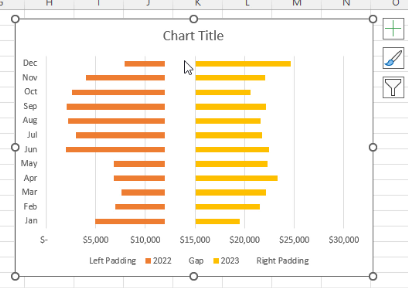
The names of the paddings written below will be removed, then the month column will be removed.
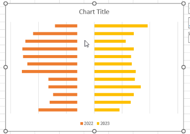
Where there was a gap bar, we will add the label, we will do the formatting of the data label, here we will add the category label.
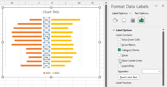
Now we have to add label in 2022 and in 2023 we will see the amount.
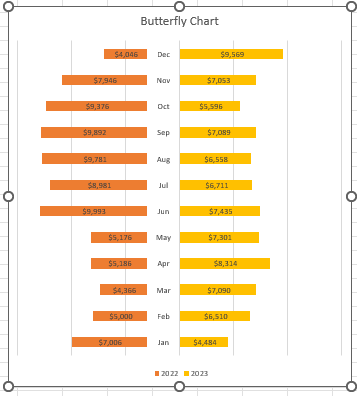
Therefore, I hope that you have understood How to make Butterfly chart in Excel, maybe if you do not understand some options, then you can comment us, which we will answer soon and for more information, you can follow us on Twitter, Instagram, LinkedIn and you can also follow on YouTube.
DOWNLOAD USED EXCEL FILE FROM HERE>>
You can also see well-explained video here about How to make Butterfly chart in Excel.


